Awardco is a software company specializing in employee recognition and rewards programs. They help businesses design, manage, and deliver meaningful recognition experiences for their employees.
The Problem
The existing admin navigation system is complex and overwhelming. Users struggle to find the information they need, leading to frustration and a reliance on support calls.
Awardco's navigation posed a challenge for a newcomer like me. My team's goal was to revamp the navigation for both clients and employees, realizing the existing system was disorganized and intricate. This sparked the question – How can we simplify a complex navigation without losing vital information?
The Solution
We aimed to completely redesign the admin dashboard and navigation to ensure users feel confident in navigating the software.
Favorites
The "Favorites" feature allows users to easily access frequently used content, enhancing convenience and personalization.
Descriptions
Descriptions provide context for features and buttons, guiding users and reducing errors. Clear descriptions also help screen reader users, ensuring equal understanding for all.
Icons
Clear, aesthetically pleasing visuals, well-labeled menus, intuitive icons, and consistent visual cues help users understand functionality at a glance.
My role
I conducted user interviews to identify pain points with the old design and contributed to all aspects of the redesign.
Through user interviews, I pinpointed pain points with the old design. These insights fueled brainstorming sessions with the talented UX intern team and product manager. Each member brought unique perspectives, leading to a well-rounded redesign that tackled user frustrations and improved overall usability.
RESERACH
Conducting testing & analyzing user pain points, informing detailed personas & customer journeys.
I stepped into the shoes of our target users and identified any issues or questions that arose during my interaction with the navigation.
Utilizing a Heuristic Markup, I systematically analyzed the website, pinpointing usability problems. These insights then informed the development of detailed personas and a customer journey.
Having mapped user pain points and their frustrating journey, we conducted user interviews for real-world validation.
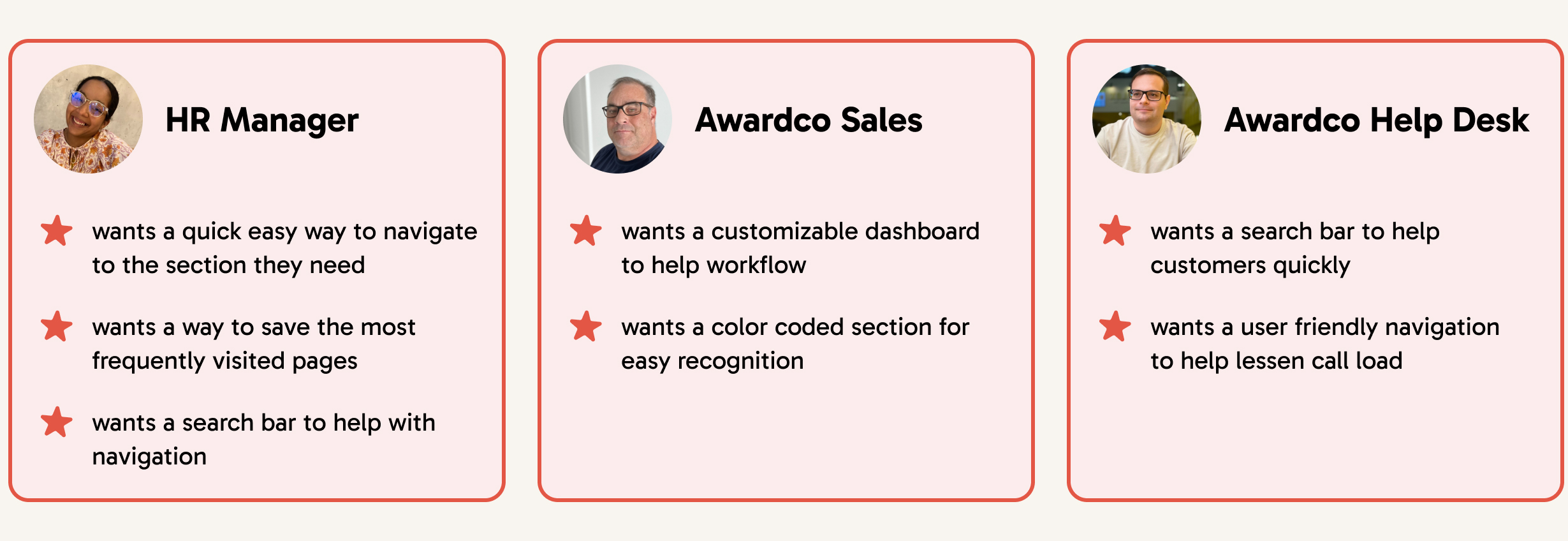
USER INTERVIEWS
Employee interviews confirmed our suspicions: Users were drowning in a sea of confusing options.
To understand user needs in our search for a solution, we conducted interviews with the following questions:
Insights Gathered:
Here are some impactful quotes that exemplify user pain points:
"I have a hard time navigating it as It's really overwhelming to look at all the options."
"We want the users to be able to navigate the page on their own without the help of our support team."
"There are options hidden within options which makes it impossible to find anything."
The user quotes all point towards a critical issue with the current interface: it's overwhelming and hinders users from navigating the page independently.
Ideation
Armed with user insights I came up with three solutions to improve the old design:
Settings Screen
In my redesigned approach, I focused on creating a separate screen just for settings navigation to make it clearer and more user-friendly.
Remove Folders
During our testing, one participant was uncomfortable using folders as they couldn't see all options on a single page. In response, I simplified the design to display all options on a single page.
Adding Descriptions
As my team was interviewing one participant preferred a brief description under each page link. In response, for my design, I incorporated short descriptions beneath each page to offer context.
Feedback
Employee feedback revealed a need for clear visibility and easily recognizable elements.
1. Fully Visible Sections
The new design makes it easier to find what you need. All options are now visible at once, unlike the previous version where some were hidden in tabs.
2. Colorful Icons
The old design used black and white icons that were hard to understand. Now, we've switched to colorful icons, making it easy to find what you need at a glance.
3. Custom Dashboard
Customizable dashboards empower users with personalized layouts for faster setting navigation.
Testing
Testing the Solutions.
After creating the final prototype, it was time to test our solutions. We asked users to complete a set of tasks using the prototype in the testing software Maze, followed by a survey to gather feedback on their experience.
1. Information
In our pursuit of effective solutions, we focused on the concept of descriptions. The results of our Maze testing was overwhelmingly positive, with 82% of users expressing a clear preference for having descriptions.
2. Recognition
Next, we aimed to ensure that users can easily recognize pages. The response was overwhelmingly positive, with a 96% approval rating, confirming its high effectiveness.
3. Visuals
Finally, we evaluated the inclusion of icons in our design to provide visual cues to users about each page. This approach received an 86% approval rating, indicating that it's a beneficial idea.
Handoff
Handing off a completely redesigned navigation system.
After creating the final screens, our team combined our individual ideas and concepts to create the ultimate prototype.
Conclusion
What I learned...
This was my first ever UX project with a seasoned and professional team! The opportunity to contribute and learn alongside these experts has far exceeded my expectations. In reflection, here are some insights I've gained from this journey:
1. Set realistic goals. In the beginning stages, I was setting overly ambitious goals that I could never achieve within the given timeline. Initially, I attempted a software redesign and reorganization of every page, overlooking the focus of the settings navigation.
2. Test as much as possible. Testing proved to be invaluable, and even though I dedicated more than a week to it, I consistently found valuable insights during each testing phase.
3. Focus on one direction after testing. After our initial round of testing, I made a decision to shift my focus onto five different aspects that hadn't been tested before. In hindsight, I should have continued refining what I already knew was effective to ensure user-friendliness.