Banzai is a financial literacy program for students that is used by over 120,00 teachers across the United States. It utilizes gamified education to teach students about managing money effectively.
The Problem
Banzai's educational courses are not accessible to children with visual impairments, creating a significant barrier to their learning.
One of Banzai's school districts asked for the Accessibility Compliance Report, necessary for their state standard. After researching the form, we examined some courses and found many elements weren't accessible, failing to meet the AA standard.
The Solution
We set out to completely audit Banzai’s courses using a contrast checker to identify and redesign failed elements, ensuring that all children can enjoy and participate in the courses.
This approach allowed us to enhance accessibility, making the courses more inclusive for everyone.
My role
I researched AA standards and redesigned elements of Banzai’s courses for compliance.
Banzai's online courses rely heavily on gray text on gray backgrounds, causing low color contrast. This not only fails to meet the WCAG AA accessibility standard but also leads to potential failures in district evaluations like the VPAT 508. Consequently, this design choice restricts the market reach and excludes users who require proper color contrast for optimal learning.
RESERACH
Embarking on a journey to decipher the ACR and VPATs cryptic language.
Certain school districts require an ACR or VPAT from Banzai to ensure compliance with state standards before using the courses. This initiated a lengthy and complex process of researching the necessary criteria for completing the VPAT. After many hours of reviewing extensive forms and using AI to clarify specific standards, I gained a clear understanding of what to look for when auditing the courses.
Auditing
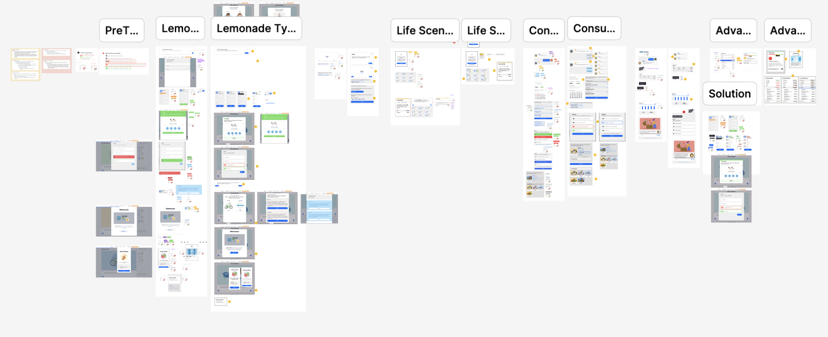
With a new understanding of accessibility, it was time to complete 20+ hours of course work and take many many screenshots.
Banzai offers a comprehensive learning library that demands significant time to navigate through all the courses and pin point contrast issues.
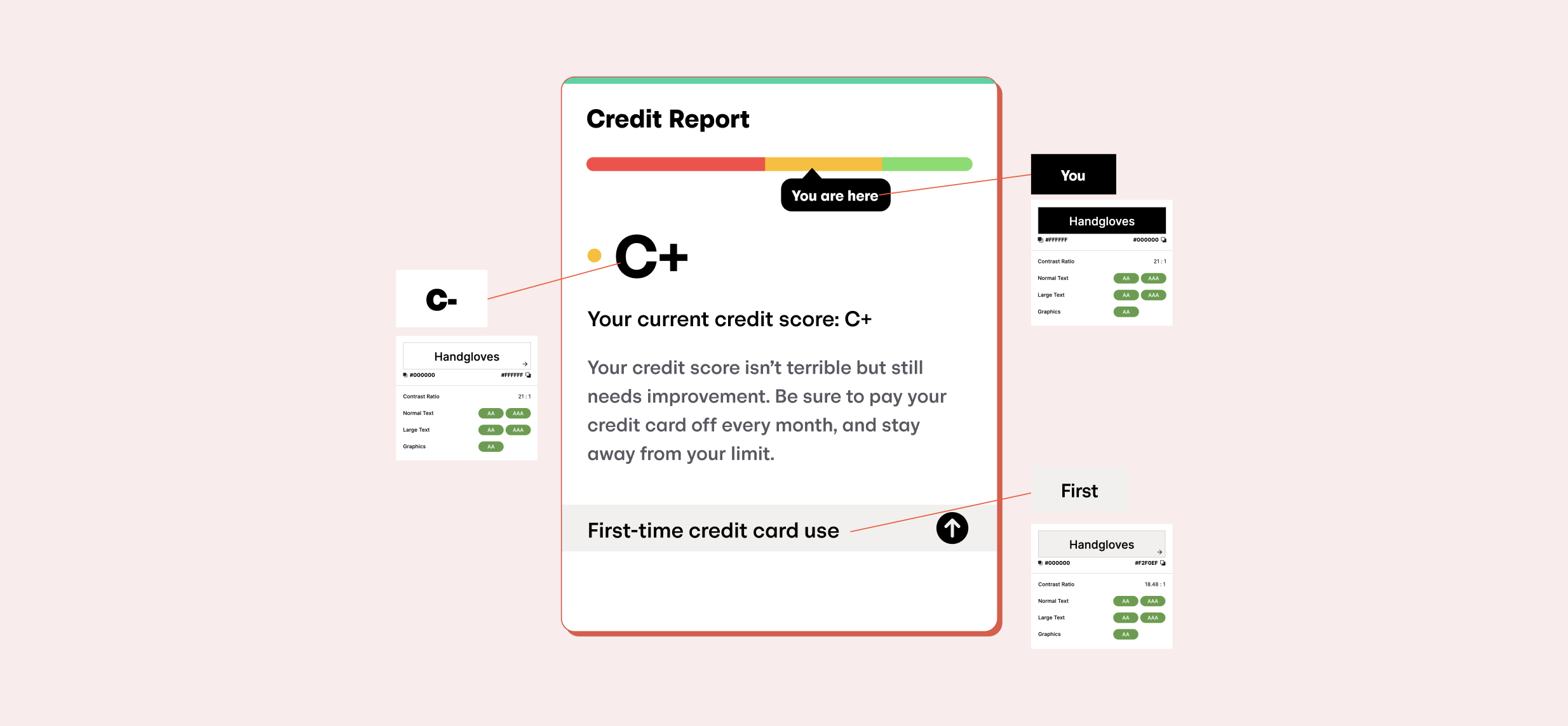
To audit, I took screenshots of any elements not meeting the AA standard. I would then recreate the element in Figma and check the contrast using a grading tool for color ratios.
Finally, I compiled all failed elements from each course into a dedicated section, meticulously identifying and pinpointing the specific shortcomings.
ideation
After 50+ contrast issues to work with, there was a consistent problem: The ever-present and unchangeable gray background.
Based on my early research, I started redesigning the inaccessible elements in each course. However, a clear problem emerged: most courses have a grey background, making many colors on top of it inaccessible.
My initial thought was to change the background to white. However, this wasn't possible as all the illustrations have grey backgrounds, and editing each one to remove the background would take hours of work in Photoshop.
What can we do instead? After brainstorming, we decided to use a white background for as many modals as possible to ensure the text would pass.
For the grey backgrounds that had to stay, I used darker colors for the text on top to ensure they met the AA contrast ratio.
Feedback
Improving the Design
Feedback: Underlined items look like links.
After speaking with my design manager I realized that my use of colored underlines to indicate positive or negative values made everything look like clickable links.
Once we identified this problem, the solution was clear: use a light-colored background and remove the underline.
handoff
Delivering a Fully Accessible Course
I created a Figma file that included two distinct sections for each of the 16 courses. The left section served for conducting audits and identifying areas for improvement. Meanwhile, the right section showcased the reviewed and updated design, now ready for development.
Final Improvements:
Conclusion
What I learned...
Handing the screens off to development, my work for the accessibility audit and redesign was done.
1. Auditing is a lengthy process. Before this project, I had never completed an audit and didn't realize how time-consuming it would be. It requires total focus to identify inaccessible elements accurately. Now, I feel confident in my ability to audit just about anything.
2. Accessibility should always be a priority in design. Accessible design is not an afterthought, it's a core principle that empowers everyone to participate in the digital world.
3. Define the process before starting. Initially, I hadn't established a defined design process, which resulted in some early design assets needing to be resized. Moving forward, prioritizing process exploration and research upfront will ensure consistency and efficiency in future projects.