Optimizing the Personal Development Interface for Maximum Impact
Product Design Intern | Project of four weeks
OVERVIEW
Banzai is a financial literacy program for students that is used by over 120,00 teachers across the United States. It utilizes gamified education to teach students about managing money effectively.
The Problem
Teachers need professional development hours for license renewal each year. Banzai needs to become a go-to destination for professional development opportunities for teachers.
While Banzai offers valuable resources for educators, teachers need professional development hours for license renewal. To remain a leader in educator resources, Banzai needs to become a go-to destination for professional development opportunities.
The Solution
We set out to build a multi-level professional development experience that would create seamless learning across all teaching levels.
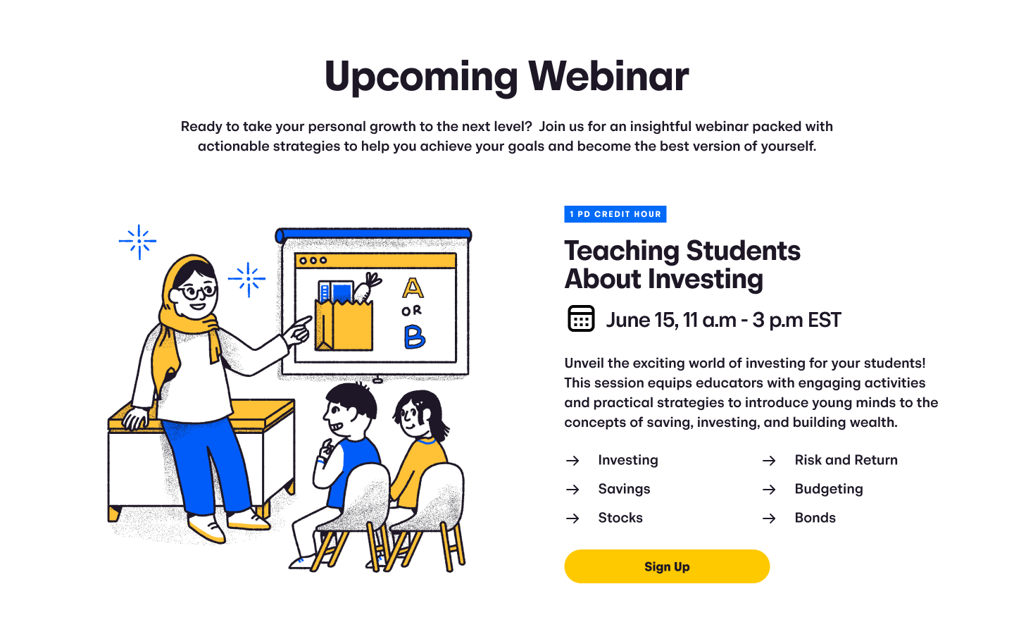
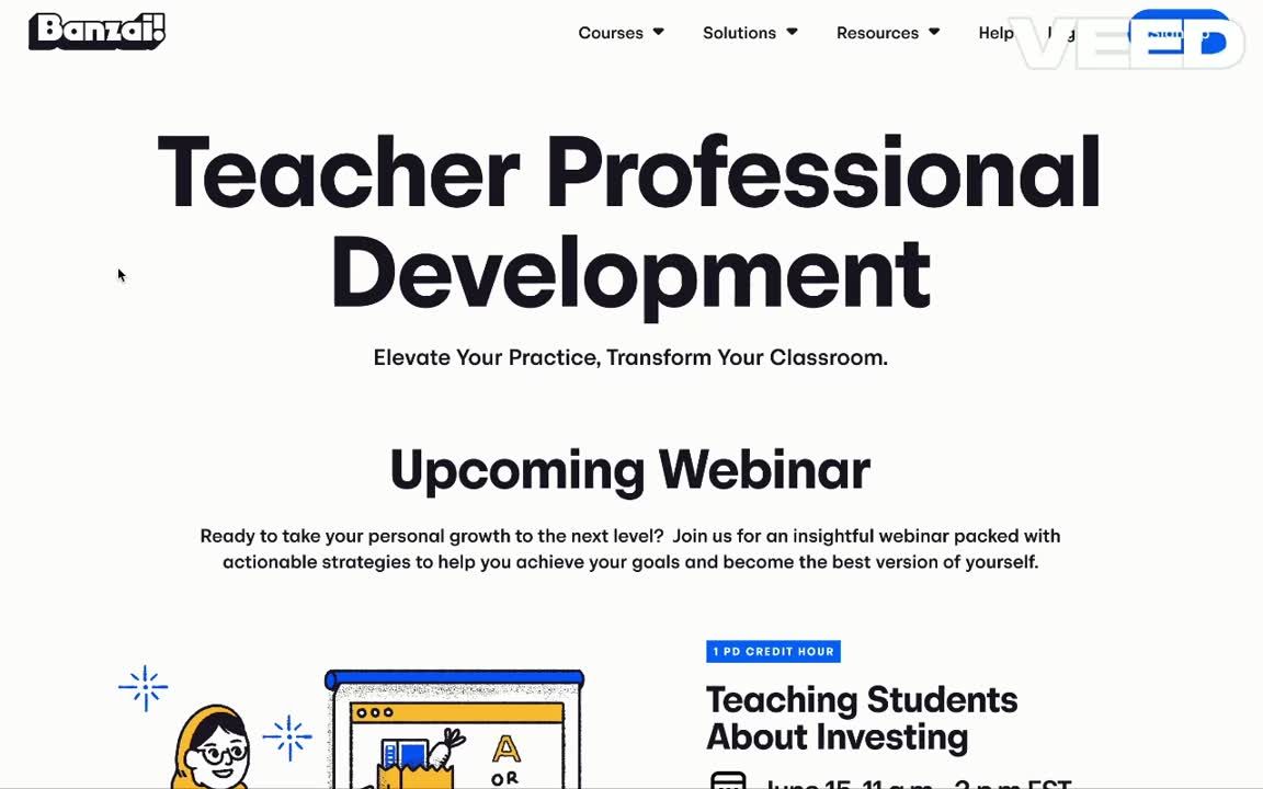
Webinars
The first thing teachers would see would be a sign up link for the upcoming webinar. This would include a Speaker Series partnering with experts we’ve networked with at conferences and members of the Teacher Advisory Board members.
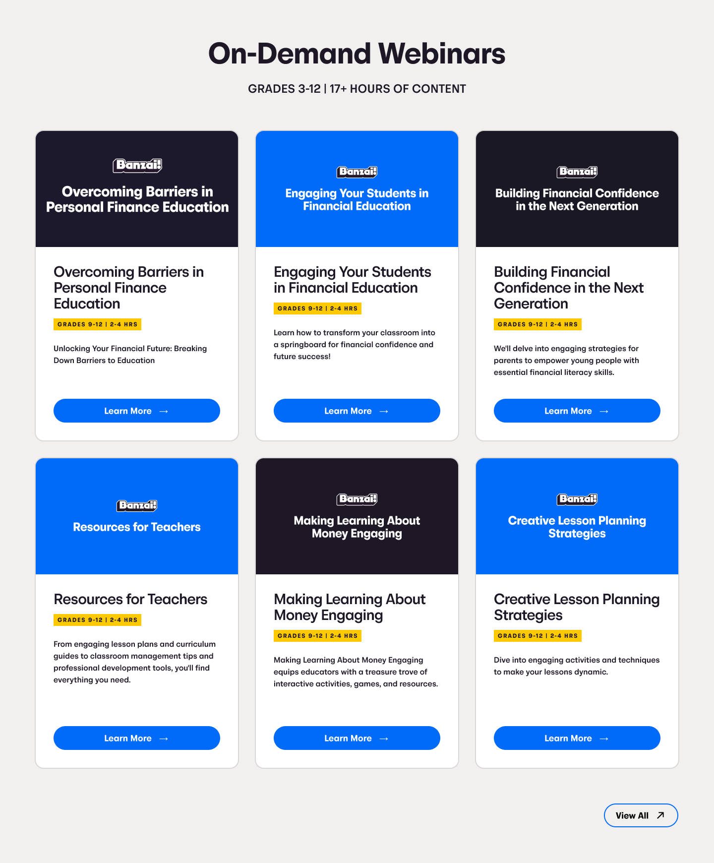
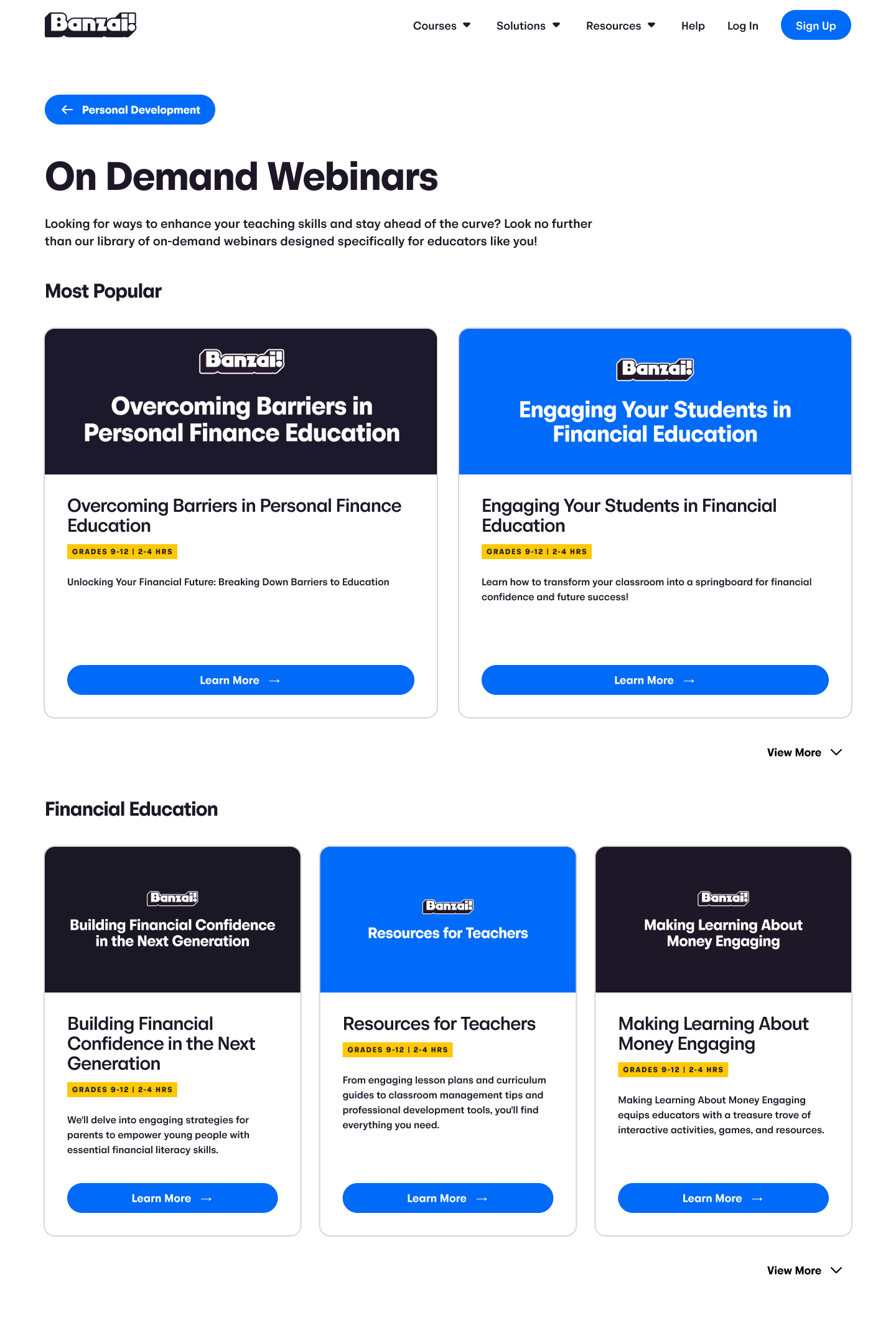
On-Demand Videos
After hosting a live webinar, the recording can then live in the On-Demand Library for teachers to access anytime. This can be built up and was designed for scalability by including a search option.
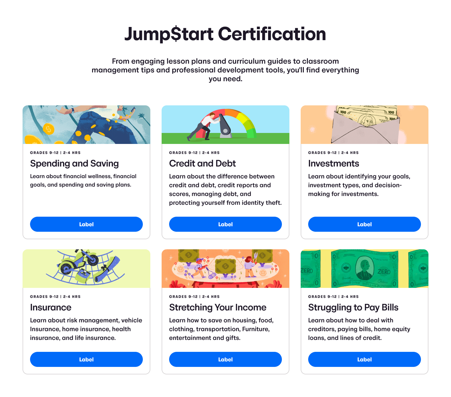
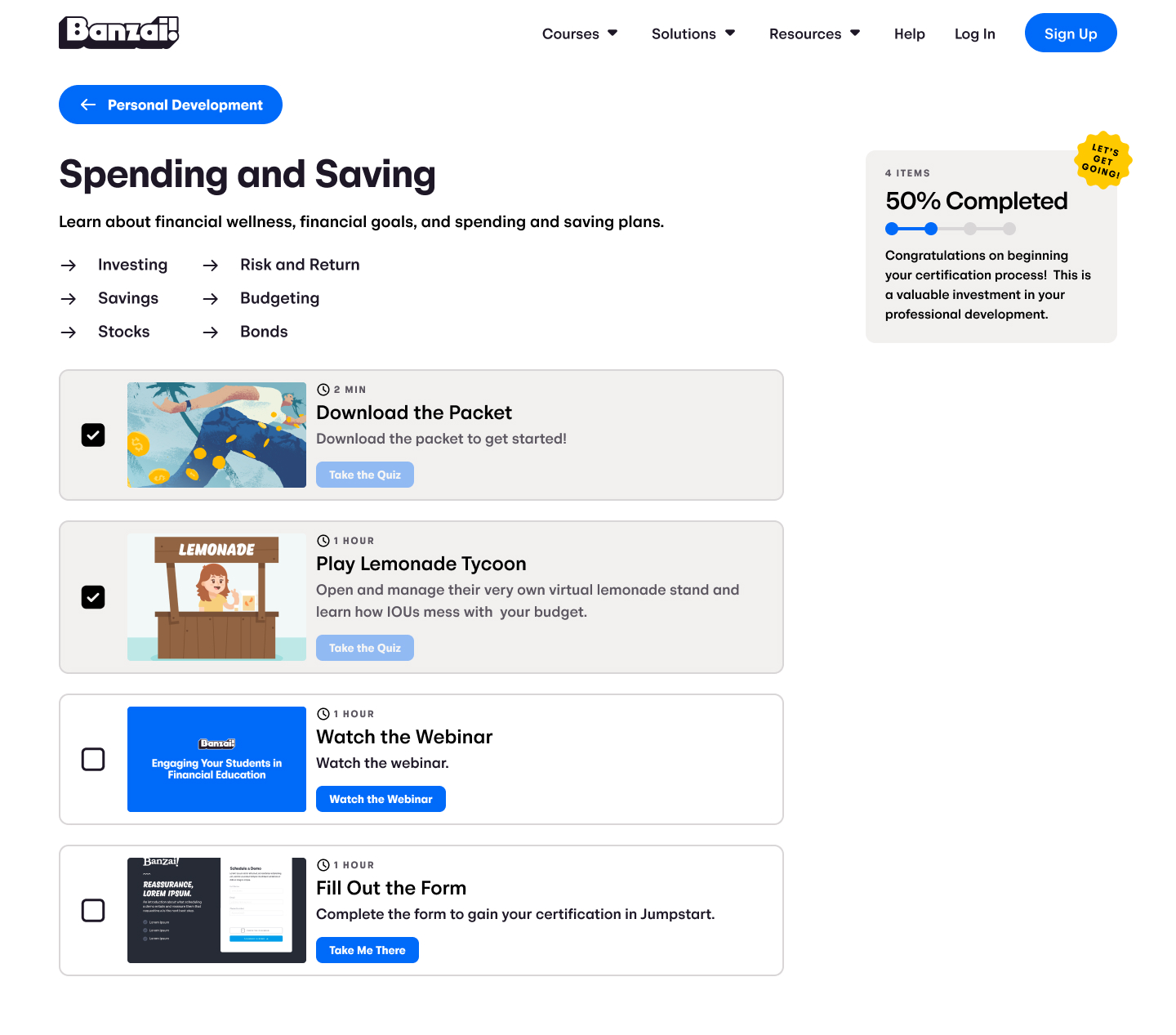
Certification Library
As an added benefit for teachers, there would be skill paths or certifications that hold their hand while they go through various resources to gain their PD credit hours.
My role
I designed the new teacher professional development interface, working hand-in-hand with the education team to prioritize user-friendliness and visual appeal.
Due to the pressing need for a PD page, I had a condensed timeframe of two weeks for design and research. This ensured a streamlined overall project, allowing for full development within a month.
RESERACH
Discovering a formula for PD websites: webinar pages, upcoming event sign-ups, and certificates with PD credit.
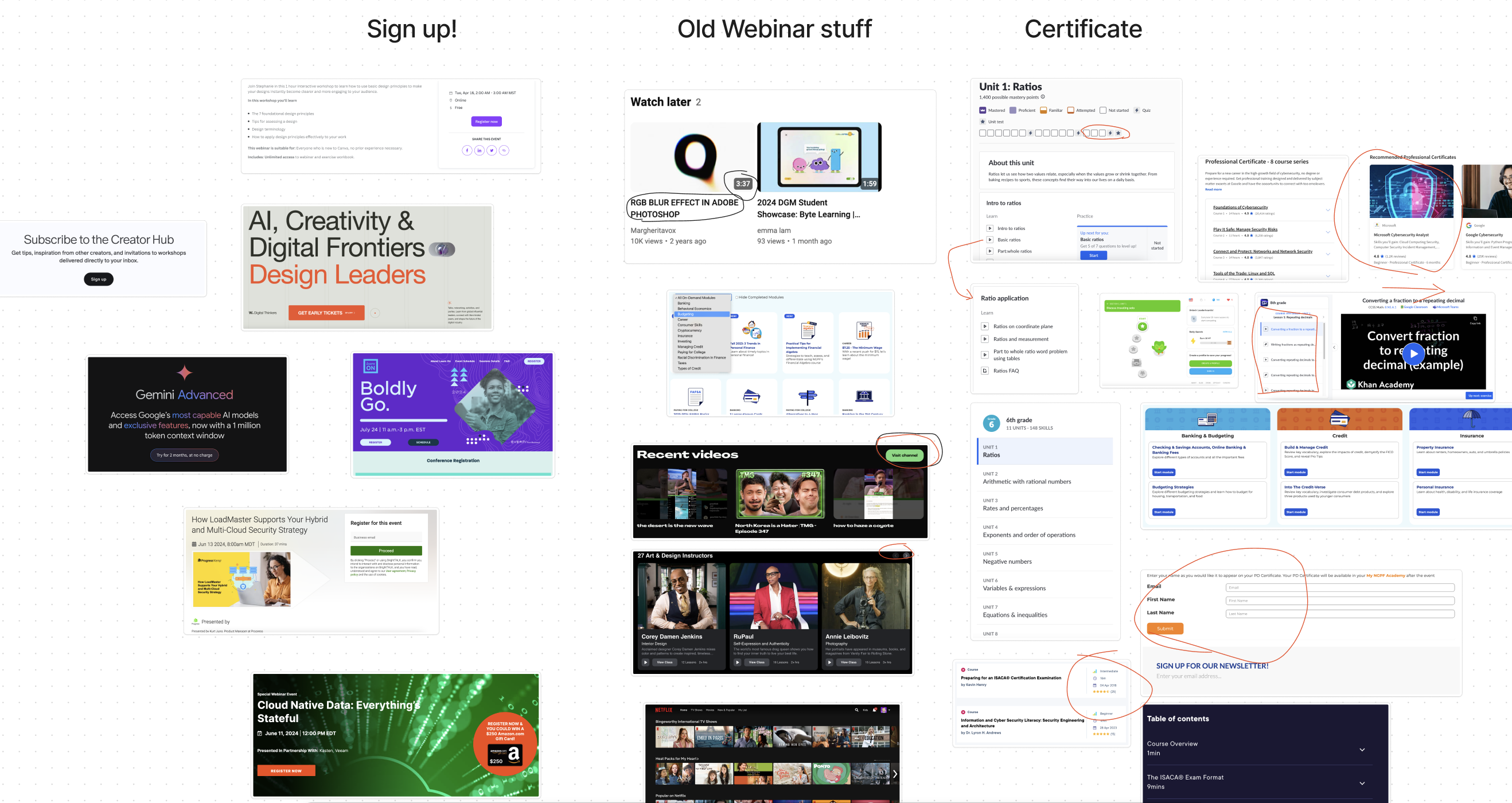
To understand the existing design landscape and identify potential opportunities, I conducted a competitive analysis of similar PD platforms.
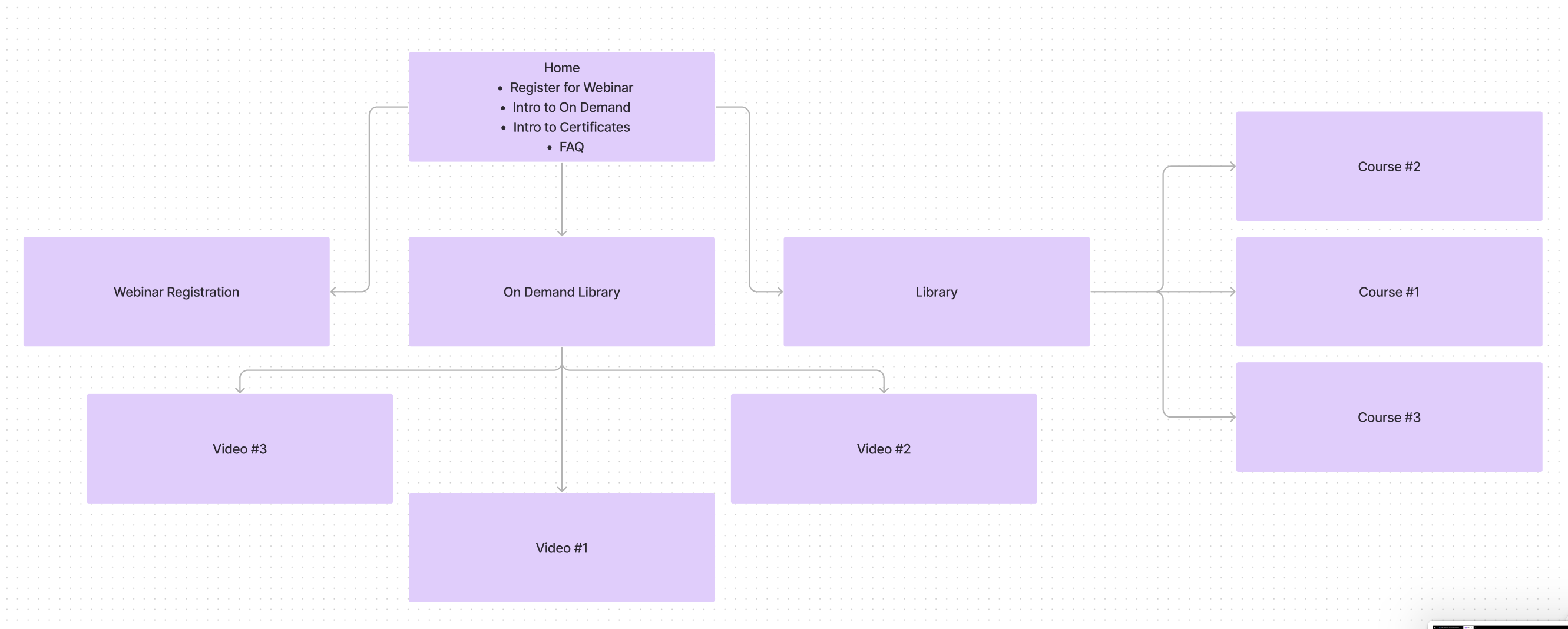
To ensure a clear information hierarchy and user navigation, I created a detailed sitemap outlining all the key pages and their interconnections.
By researching the website's core elements and navigation structure, I gained a solid foundation for creating the new page designs.
Ideation
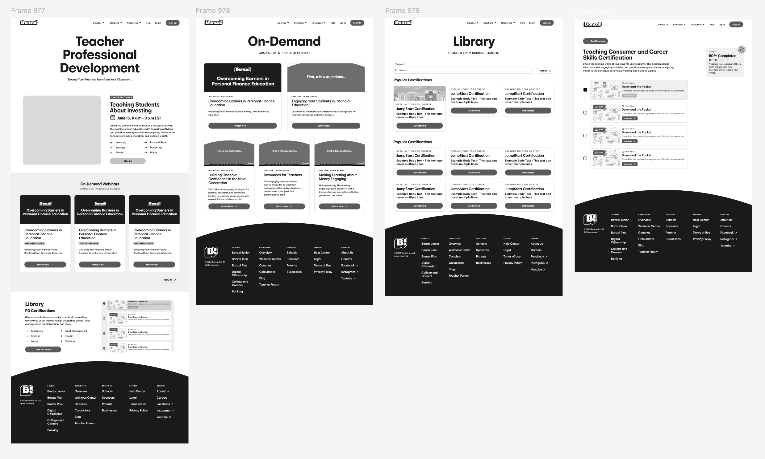
A vision of a dedicated PD homepage with sections introducing registration, on-demand webinars, and the certification library came to life.
Sketches
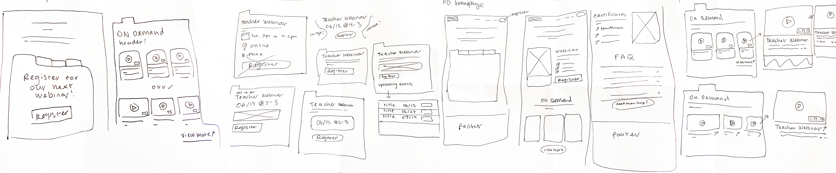
To translate this vision into a tangible user experience, I began creating sketches that outlined the layout and functionality of the site.
Wireframes
The initial sketches were then refined into high-fidelity wireframes, providing a clearer visual representation of the user interface and interaction flow for each section of the PD homepage.
Feedback
Uh oh! The education team challenged the design, prompting a shift to integrate PD seamlessly within the Banzai platform, requiring a complete navigation redesign.
Embracing the education team's feedback, I pivoted the design to seamlessly integrate PD functionalities within the existing Banzai platform. This required a complete navigation overhaul, and I tackled this challenge by brainstorming three new design concepts that consolidated everything onto a single, user-friendly page.
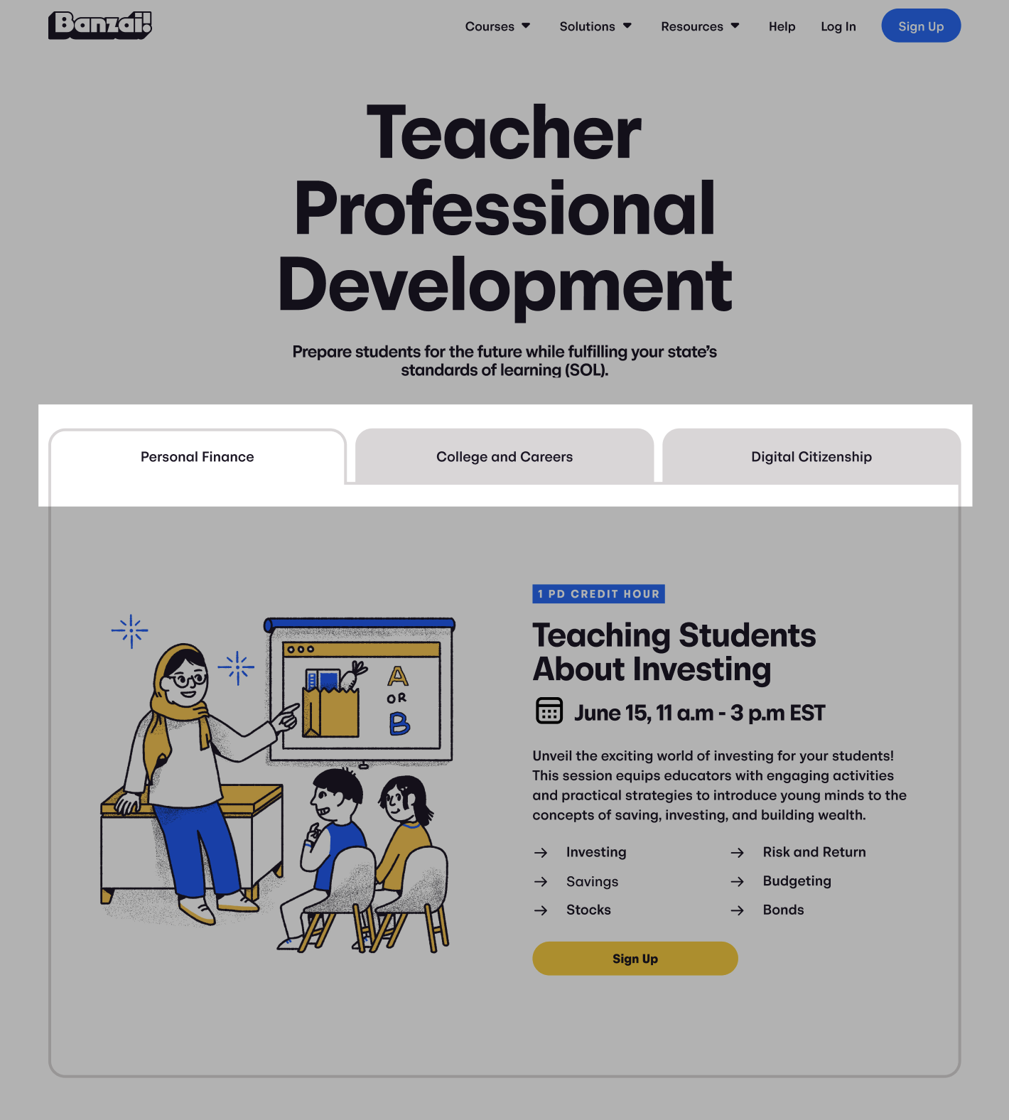
1. Large Tabs
The larger, folder-style tabs offered a clear visual hierarchy with easy switching between the three sections. However, their design limited the amount of content that could be displayed within each tab.
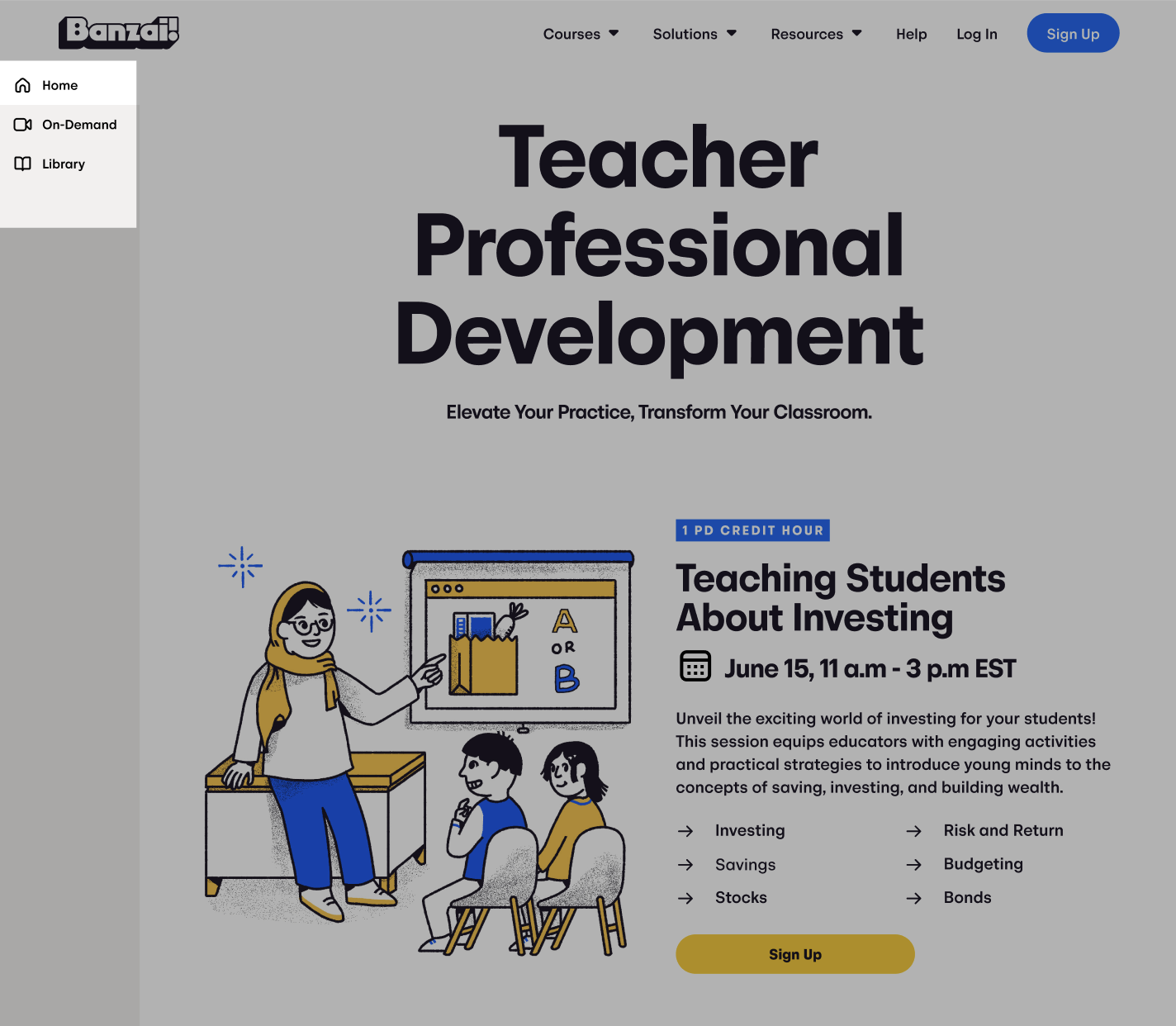
2. Side Navigation Bar
While a side navigation offered convenient section switching without scrolling, its longer development time led us to explore alternative navigation approaches.
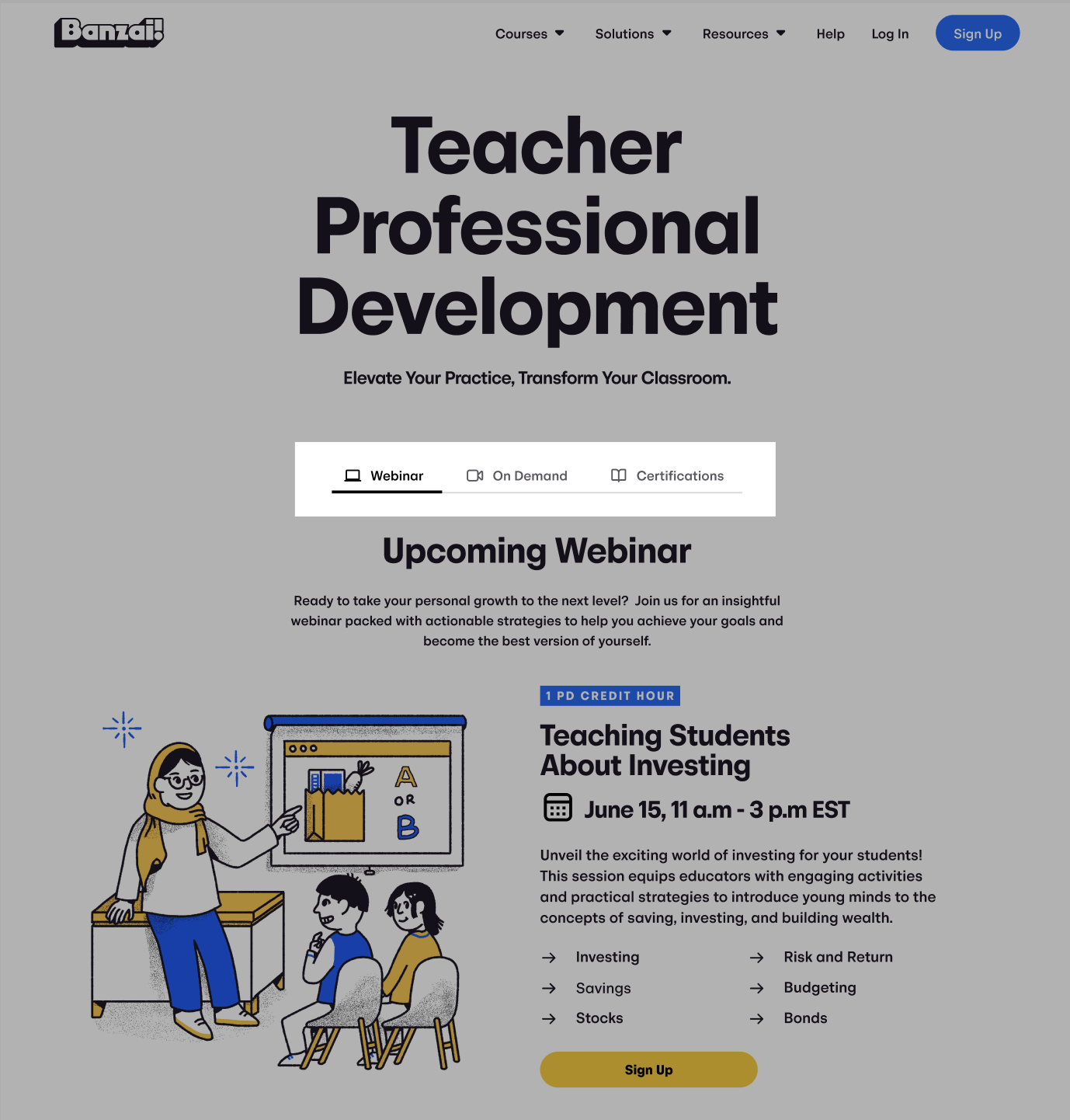
3. Small Tabs
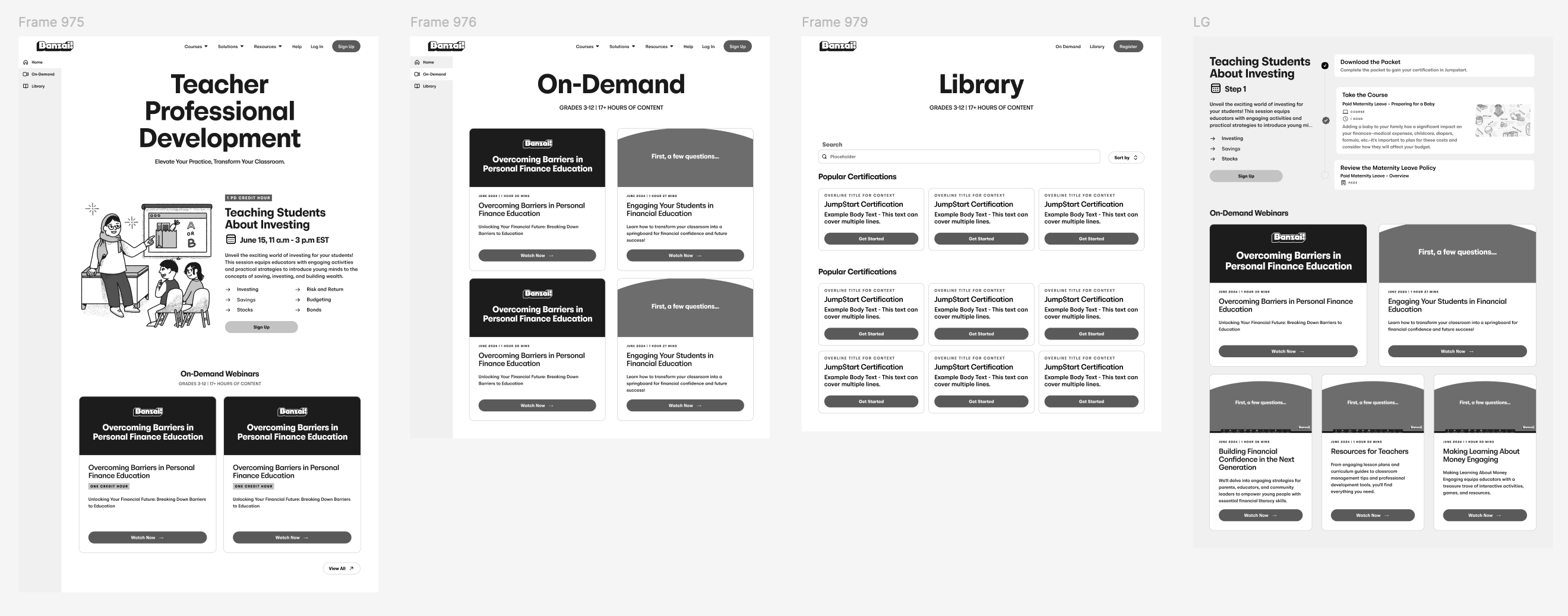
While visually similar to the larger ones, the small tabs cleaner design offered a clearer distinction - each tab represented a dedicated page for its topic, unlike the larger tabs that felt more introductory. This focus on user experience and clear navigation is why we ultimately chose the smaller tab design.
Testing & Iterating
Testing the solutions and doing a final iteration from the insights gained.
With the first Figma prototype ready, we moved on to gather user feedback. We presented participants with a set of tasks to complete within the prototype, observing and recording their interactions to gain valuable insights.
Impactful Quotes:
"The tabs feel disconnected from the rest of the page."
"I would like to be able to see how much further I have to go in the certification."
"I would expect to find the webinars on a different page rather than in a tab."
Valuable insights from user quotes directly informed several key design improvements for the site.
Improvements Made:
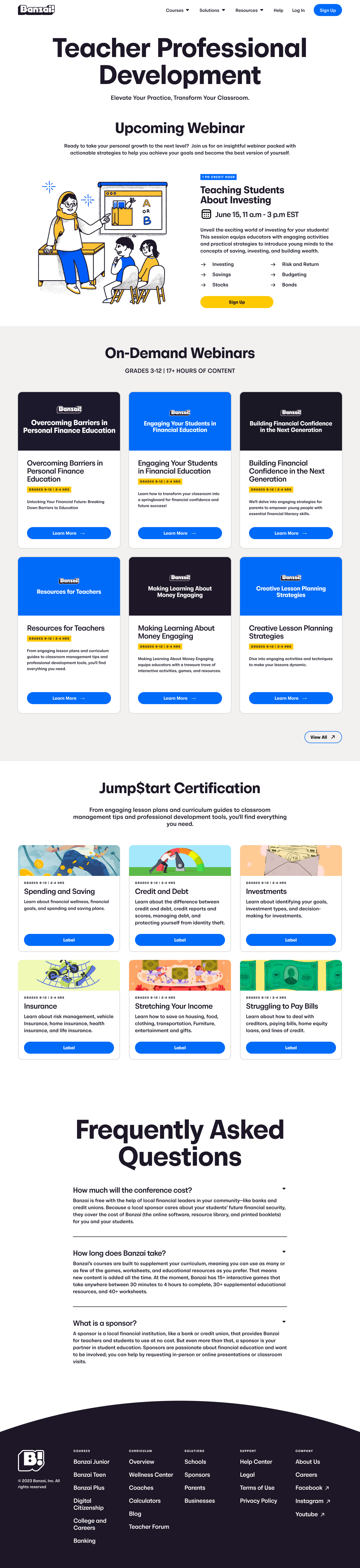
1. Scrollable Page
We opted for a single, scrollable page design in lieu of tabs. This approach better aligns with users' natural behavior during testing, where they intuitively scrolled to navigate content.
2. Progress Bar
To provide a clear visual indicator of progress while completing the certification checklist, we've implemented a sticky progress bar in the top right corner. This design choice ensures users can easily monitor their progress as they scroll through the checklist.
3. Separate Webinar Page
With a focus on future growth, we decided to move the on-demand webinars to a dedicated page. This independent space offers increased scalability, allowing the library to expand and accommodate a vast collection of webinars.
Handoff
Handing off a completed page design.
Following a productive two-week design and testing cycle, the project transitioned to the development team.
Conclusion
What I learned...
This project stands out in my internship for the invaluable lessons learned through collaboration. While the entire process was engaging, the most significant takeaway was the importance of working effectively with non-designers. I honed my communication skills to ensure clear understanding of the vision throughout the project. Additionally, I learned the importance of maintaining well-organized design files that are easily interpretable by non-designers, fostering a smooth collaborative workflow.